When it comes to eye-catching color combinations, British Columbia-based Arc’teryx has been long regarded as a standard bearer in the world of alpine and outdoor apparel. Since the company’s inception in 1989, Arc’teryx has built, and built upon, a seemingly preternatural sense of color theory to design a line that is as singular as it is stunning.
But coming up with a lasting color palette isn’t as simple as keeping on-trend and pivoting according to the market’s whims. There is a mystery in the work, as intuition and inspiration hold equal importance with market research and brand identity. Talking with Carmen Worsfold, Manager of Product Merchandising, and Kristi Birnie, Director of Color Design and Color Merchandising, it becomes apparent that the landscape of British Columbia informs the company’s designs as much as the traditional tools of lightness, saturation and hue. “In terms of gaining inspiration, I think a lot of it comes more from the designers, the color designers’ more instinctually feel, but also looking outside, looking to nature for inspiration,” says Kristi. “If you come to our offices, you’ll see that we kind of face the mountains, beautiful north-facing views, so I think a lot of the inspiration in general is coming from the outside world, certainly from nature. The influence from fashion is more predominant than it used to be, but I think a lot of it is happening subconsciously. Arc’teryx is a little more independent or revolutionary than ever wanting to fit in for the sake of fitting in. So I think that the nature of artists being on the forefront of color naturally puts them on a similar cycle of when certain colors get old and when other colors look fresh. I think a lot of it is the work of a collective subconscious.”
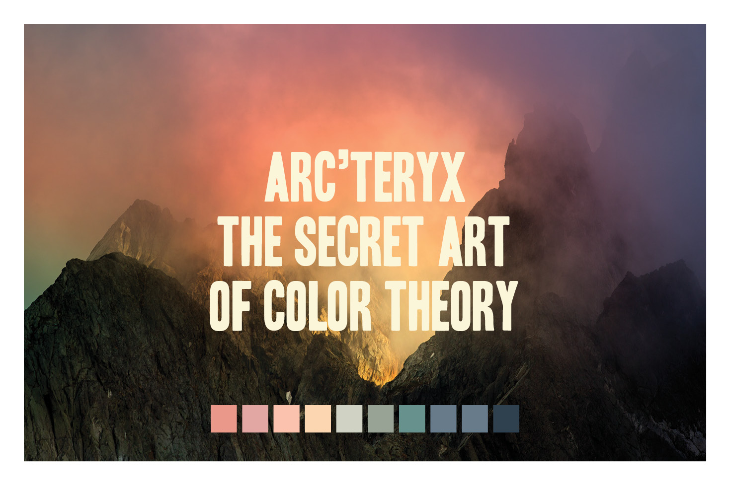
Rather than staking their company’s aesthetic identity on a single color, spectrum or palette, Arc’teryx instead seeks to create an organic motion from one season to the next, as last year’s primary colors become harmonizing accents on the next season’s line. “We’ve been a lot more focused on building those beautiful balanced harmonies more so than a single color, particularly over the last eight years,” Kristi explains. “We’re creatively problem-solving a puzzle, and then all the challenges that come with that because there are a ton of constraints.” Carmen adds, “I do think it’s those beautiful colors and color combinations that will always resonate no matter what. Whether it’s 10 years ago or 10 years from now, I think beautiful colors are beautiful colors, and they’ll always have a place.”
Even as the industry moves away from the “pink it and shrink it” paradigm of women’s outdoors wear, Carmen is careful to point out that any color can be powerful, as long it is harmonized in fresh and interesting ways. “I think that if there is a unique way in which Arc’teryx can do some sort of a bubblegum pink with kind of an earthy brown color, then I don’t think that should be off-limits. I think it’s more about reinventing that bubblegum pink and putting more of an Arc’teryx spin on it.”
“Of course, we’re always trying to pick a very ‘power pink.’ That’s the difference, right?” says Kristi. “A baby pink motorcycle helmet or jacket is very patronizing, but if it had guts-and-glory undertones, then I think it would be something people would be proud to wear.”
This article was originally published in RANGE Magazine Issue Five.
LUKE WOODS