A few weeks ago, some of the RANGE crew ventured over to the California Theatre in Berkeley for the screening of Sender Films’ new documentary, Valley Uprising. Presented by Reel Rock Film Tour and co-directed by Pete Mortimer and Nick Rosen, Valley Uprising tells the story of Yosemite’s 60-year climbing history. The feature-length film utilizes brilliant footage and interviews with climbing legends from “The Golden Age” to “The Stone Monkeys,” including Royal Robbins, Lynn Hill, Dean Potter and Alex Honnold.
We were were beyond impressed with the film’s ability to connect the past and present with original motion graphics, so we decided to reach out to Barry Thompson, Valley Uprising’s Motion Designer, to get an inside perspective on the development of the film’s graphics.
Q. How did you become involved with Reel Rock and creating the graphics for Valley Uprising?
A. I have worked with Sender Films for nine years now. I met the director, Pete Mortimer, even before that on a climbing trip into the Cirque of the Towers in Wyoming.
Q. How were climbing photos from master photographers involved in the historical graphics you created for the film?
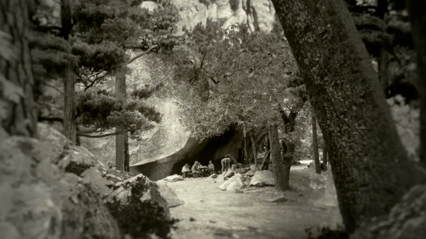
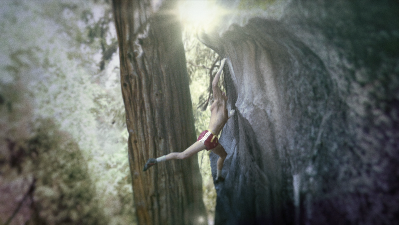
A. The climbing and cultural Yosemite photos shot by Glen Denny, Tom Frost and George Meyers were so inspiring to work with! Each photo told a story and it was my job to break them apart, composite them into a deeper surreal space, and make us feel closer to that moment in time, or even in that moment totally.
Q. Valley Uprising spoke to several periods of climbing history in Yosemite National Park. How did your motion design work to support seamless transitions from one period to the next? How did the graphics bring periods like the Golden Age back to life?
A. At the beginning of the project, Pete Mortimer and Nick Rosen were handed hundreds and hundreds of great photos from these master photographers, and together, we all quickly agreed that a motif of a slide carrousel would be a good fit for the transitions. I did some more visual research and came across an image of the interior of a slide projector, and BINGO! It was abstract and dynamic, and gave us room to label graphically the period and cultural shifts throughout the film.
The overall art direction of the film was based on looking back into these historical moments, and giving each era its own look and feel, but at the same time, gelling them all together into the slide carrousel motif. For example, in the “The Golden Age,” we worked with so many black and white images that had grain, dust and hairs on the photos. I really like those characteristics of film photography, so in Photoshop, I would lift these elements from the photos, reuse them later on top as a composited layer, and then push a camera through the dusty-looking glass into the scene. Also, I added sunlight, floating dust or pollen, and played with the depth of field and camera moves to focus the viewer’s attention on specific visual story details.
Q. What inspired the graphics you created for the film? Were there any goals or visions you kept in mind?
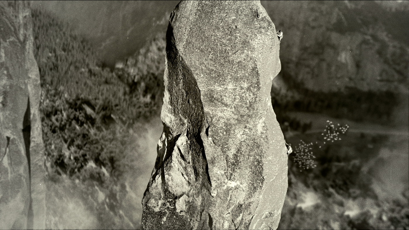
Inspiration came from many years of watching documentaries and visual effects in films such as Inception. I worked with 3D animator Wesley Meeks to create some of the more dimensional camera mapping effects like when we needed a camera to fly around a standing pillar. Also, visual effects artist Marty Blumen brought the huge main headwalls of the Valley to life, combining 3D and Nuke compositing. In the rock climbing environment, there is a lot of space drifting below you as you climb, and Peter really wanted the audience to feel that vertigo.
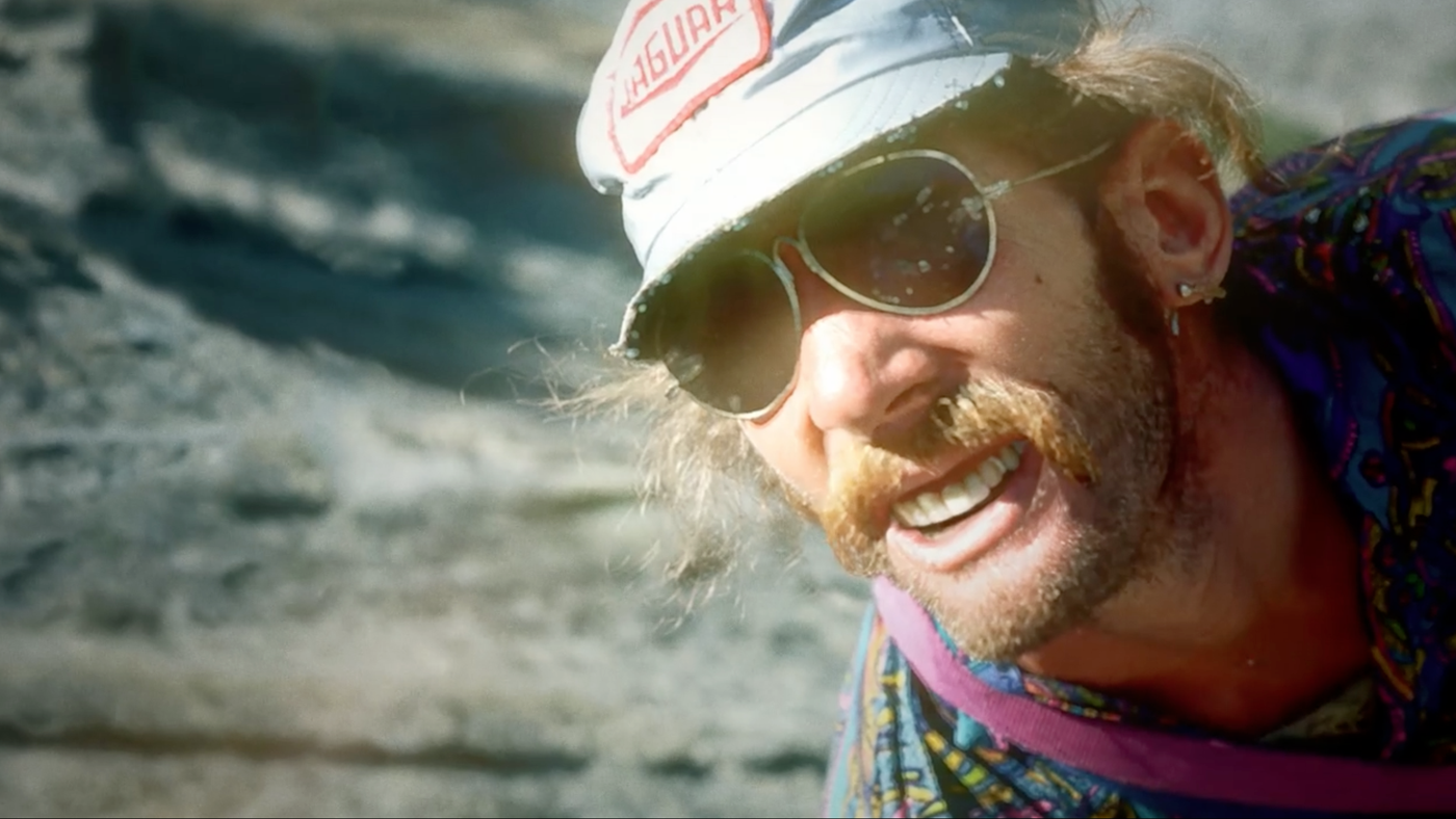
All the graphics had a purpose: to tell the story. If the moment was funny, like people smoking exploding weed because it was drenched in airplane fuel, I chose a campier, silly style and went way over the top with it. If the story moment was one of tension, the photos were treated in a way that added drama. I was given a lot of freedom with the images, which is really unheard of in documentary work. I really respect Pete and Nick’s belief that the story is the most important thing, and their direction to tell it by any means possible with the box load of images we had to pull from.
Q. When we saw the film in Berkeley, the entire theatre was roaring with laughter, and everyone seemed to connect with the quirky climbing culture in Yosemite. How do graphics and motion design enable viewers to connect more deeply with films?
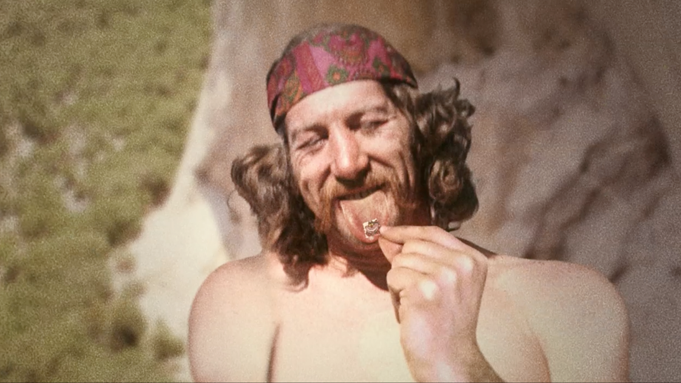
I am so glad they were laughing because I was laughing my head off and having way too much fun at work those days. I remember working on silly scenes, one in particular, which was the Jim Birdwell on acid shot. I really went for it with an explosion of colors and his eyes popping wide open. It is really fun to design motion graphics or composites that heighten the comedy of the moment. By exaggerating colors and movements, we add energy that would not have been there if we just showed a still image.
Q. Is there anything else you would like to add about the craft, time and dedication put into Valley Uprising? What does it stand for and what does it mean to you?
A. I am just super grateful that Pete and Nick wanted to push this documentary to another level. They both had a sense of humor and kept driving forward. Valley Uprising is about the struggle for freedom, respecting our climbing pioneers, and remembering to live each day stoked. Jack Kerouac put it best: “Because in the end, you won’t remember the time you spent working in the office or mowing the lawn. CLIMB THAT GODDAMN MOUNTAIN.”
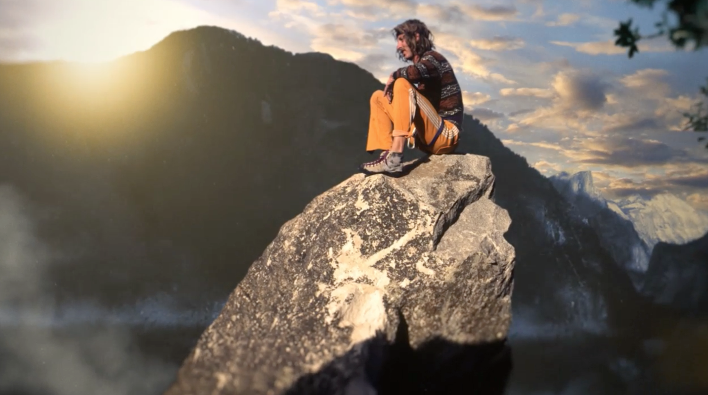
Be sure to click through the gallery of still images below to check out some of Barry’s incredible work in the film. Also, if you haven’t seen Valley Uprising yet, search for a screening near you!
Photos courtesy of Sender Films.
XX SYDNEY